0
Under review
Community maps - list suggestions

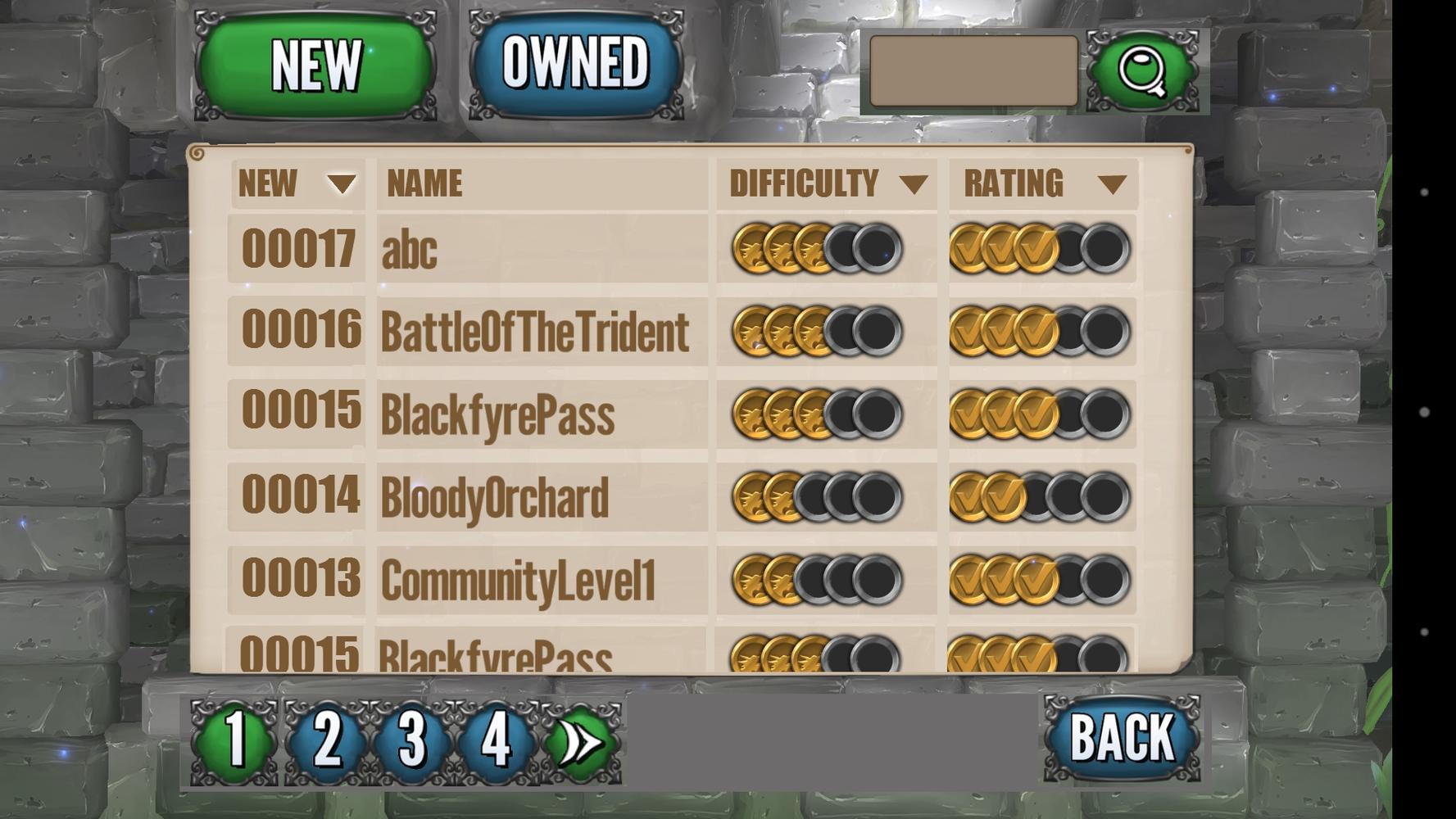
1. Default order by release instead of alphabetical (Look at "abc" map popularity). Default by rating seems premature until fixing the rating bug and rating disparity increases.
2. Display number ID to map info, this way:
- indicate the order without the date (irrelevant to end user)
- people can pin-point their map
- distinguish maps with the same name
- order is nice for some users as it may solve eventual rants of plagiarism
- maybe this would help the problem of resurrecting banned maps, as the ID would've been taken.
Or put a "Sort By" combo box on the upper right to make it even clearer.
4. Put either the search field or the the pages numbers on that empty space upper right to remove clutter bellow.
5. Delete old test maps. Incentive some people to make new ones by showing their proud creation will be prominent instead of being already leveled on a sea of unpolished tests.

6. Tip on the home screen: "Need more crystals? Create a map and you'll receive 50-100 crystals for each download it gets."
Kudos, because this is a very nice mechanic that alone should promote more word of mouth buzz, hook some people to return frequently (amateur stats junkies like me), and ultimately promote sales. But this great idea is currently unknown by everyone in the world but 5 people.
7. I like the scroll possibility. Seems intuitive and faster to browser if you indicate continuity with half line. As we're seeing (and google knows), second page gets very little love. This suggestion is very unimportant.
8. I'm Tricky Truck fan boy, take some suggestions with a grain of salt.
Customer support service by UserEcho


But yeah,nevermind it. That one should have little more impact than eye candy.
PS: I do not expect all suggestions to be considered good and worth implementing, I'm just trowing what comes to mind.